New Venmo
UI Design | 2019

Why a New Venmo
I really like the idea of using a mobile app to easily transfer money between your networks. I started using Venmo on a monthly base in 2018. Every time I wanted to pay my friends I needed to think about the process of searching/finding my friend? I was not clear where I needed to find things that I want. It was too far different from my mental model. Since I was not using this app very often, I was facing the same problems over and over again. The only reason I was using it was because most of my friends had it and it was convenient to have it.
What Did I Do?
Analyze Current Design
Design Critiques, Research
User Research
User Experience Study, Personas, User Testing
Ideate
Brainstorming, Problem Definition, Information Architecture
Prototype
Paper sketch, Wireframe, Typography, High Fidelity Screens
Design Critiques
1
Hard to Navigate
Venmo uses a hamburger menu instead of a navigation bar. Which makes everything so unclear. For example, after launching the app, it is not clear in which screen has the app landed in and how can the user navigate to other screens?

2
Unnecessary View Filters Without Adding Values
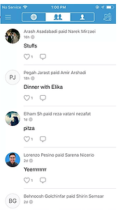
Is anyone interested in seeing a total stranger's transaction and leave a comment on it? Well, you can do that in Venmo!
Main mission of a Venmo user is to make or request a transition and having access to history of my previous transactions. I understand the idea of socialization and networking, but it is strange to start networking with another person based on a transaction that they made without even knowing their location?
Global Feed
Friends' Feed
User's Feed

3
Confusing Icons with No Signifiers
You might be a little confuse on how to scan a SQR code or to make/request a new payment but don't worry you'll get use to it if you use Venmo frequently.

?
?
4
Which Color Means Selected? Blue or White?
Does the blue shade means an option selected or the white? If it's the blue, Pay/request button is blue too, so it means that it's selected? In the home page, if a white button means selected but in people's profile it is blue!
Feed

Between You

The New Venmo
User Research
To do a user study I have specifically focused on my network who were currently using a Venmo mobile app (I used Venmo to find friends who are a Venmo user.) Then, based on their feedback and comments wrote up my Persona and User Journey Map.


Paper Prototype
After running the user research session, I have decide to design the new interface with a navigation bar on the bottom of the main screen which contains the following icons:
1- Me (User's profile)
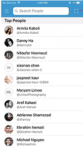
2- Search (People)
3- New transaction (Pay/Request)
4- More (Setting, Notification, etc.)

Home

Other's Profile
More
New Action
Search

Pay

Confirmation
Information Architecture
Here is the information architecture of the New Venmo together with the final high-fidelity screens.
UX Improvements
Now let's see why and how my new design of Venmo has a positive impact? And what values is it adding to users and the business?

Easy to Navigate
Adding a navigation bar to the bottom of the screen helps users to recognize their location in the app at all times.
Your History at a Glance
In Profile screen, now users can see the amount of money they gained as well as what they owe to other people. This way a user can always be synced to the latest updates and changes in their account
More Privacy
Instead of having access to everybody's transactions (like the old-Venmo) now users can only see the history of transactions between themselves and others. This will keep users' information safe and secure.
Transparency and Trustworthy
Number of Transactions and Friends for each user are added to increase the transparency and build trust among users.
Providing these numbers, in case of uncertainty, you can investigate more before paying another person.


Error Tolerant
The confirmation page first summarizes the action that just took place. Then it provides an Undo option so that the user can edit or cancel the transaction in case of error.
Save Time
In the New Venmo, users can now add multiple recipients at the same time and and request/pay them at once.